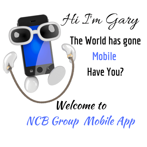
Mobile App for Small Business
Call: 914-623-8692
E-mail: thencbgroup@gmail.com
Our Services
Our Services
Web Design Development for Mobile, Tablets & Desktop
"Do you have a mobile-optimized website? If you don’t, this should be your top priority for engaging mobile customers. 57% of users say they won’t recommend a business with a poorly designed mobile site, and 40% have turned to a competitor’s site after a bad mobile experience."
Source: Google 'Mobileplaybook' UK (2012)
Websites designed for Desktop don't work for Mobile users
Websites designed for Desktop and Laptop PCs (90% of websites) do not work well when viewed on Smartphones or many Tablets. Mobile users are constantly having to pinch and zoom in order to read a site's content, whilst navigation links can be impossible to target (touch based devices use fingers to activate links, not a mouse cursor). Overall this makes for a frustrating, unpleasant experience for the mobile user.
To create your mobile ready website...schedule your 1-on-1 below.
Design & Build Mobile Apps
Our mobile app, an all-in-one marketing tool are primarily for small businesses who would like to advertise their business to bring in new customers and increase repeat business. You can: Create a social media buzz. Give customers GPS direction from anywhere. Keep customers informed with your business news and deals. Allow customers to directly contact you quickly and easily. Build brand loyalty and encourage customers to become frequent buyers. Weekly updates of your promotions and more.
To advertise your business...schedule your 1-on-1 with us below.
Blog Management
Having a blog is a simple easy to use platform for connecting with and sharing current information with customers, and its a direct communication platform.
A blog can create a two-way communication with potential customers, prospects and clients. It encourages interaction. You can tell your brand story. A great marketing tool to offer more insights into your company, employees, goals and ideas.
Our Blog Management Service, the key to your success. Schedule your 1-on-1 with us below.
Free Consultation
Don't let another day go by without connecting with your targeted audience. Contact Us Today and find out what a well managed, budget friendly social media campaign can do for your business.